Designing your dream home often begins with a simple yet significant question: what colors will truly make this space your own? Whether you’re planning a renovation or starting from scratch, the process of selecting a color palette can feel both exciting and overwhelming. The right hues can transform your space into a haven of comfort, energy, or sophistication. This guide will take you step-by-step through the art of choosing the perfect colors, helping you craft a modern house colour design that speaks to your personality and style.
Start with a Vision Board
Before diving into paint swatches, curate a vision board. Use magazines, Pinterest, or physical samples to gather inspiration. Look for patterns in the images that resonate with you—perhaps a recurring shade of blue or a preference for earthy tones. A vision board helps you see the bigger picture, setting the foundation for your modern house colour design.
Know The Power of Colors
Colors evoke emotions and influence how we perceive spaces. Before choosing a palette, familiarize yourself with the psychological effects of colors:
- Warm Colors: Red, orange, and yellow create energy and warmth, ideal for social spaces like the living room or kitchen.
- Cool Colors: Blue, green, and purple bring calmness and are great for bedrooms or study areas.
- Neutral Colors: White, beige, and gray offer versatility and elegance, perfect for creating a modern house colour design.
Understanding these basics helps you decide which colour is best for house interiors based on functionality and ambiance.
Know the Significance of Colours in Vastu Shastra – Ghareka
Apply the 60-30-10 Rule
The 60-30-10 rule ensures balance and elegance in any space. Here’s how it works:
- 60% Dominant Color: Walls, rugs, or large furniture.
- 30% Secondary Color: Upholstery, curtains, or cabinetry.
- 10% Accent Color: Pillows, artwork, or decorative pieces.
For example, in a house elevation colour combination, a neutral dominant shade paired with bold accents can create an inviting exterior without overwhelming the design.
Understand The Color Wheel
The color wheel is a timeless tool for mastering color harmony. Knowing how colors relate to each other allows you to make informed choices for your home. Using the color wheel is a practical way to approach how to select color for home interiors and exteriors.
- Analogous Colors: These sit next to each other on the wheel and create a harmonious, soothing effect.
- Complementary Colors: Opposites on the wheel (like blue and orange) provide striking contrast.
- Monochromatic Scheme: Variations of the same color offer a cohesive and minimalist look.
House Elevation Color Combination Tips
The exterior is the first impression of your home. A well-thought-out house elevation colour combination enhances curb appeal and sets the tone for your interiors. Here’s how to choose a standout palette:
- Match to the Surroundings: Blend your house elevation colour combination with the surroundings or natural landscape for harmony or choose contrasting tones to stand out.
- Highlight Features: Use darker shades for trims and lighter ones for walls to emphasize architectural details.
- Complement Roofing: Ensure your wall colors align with the roof and window frames for a cohesive look.
- Accent Features: Highlight architectural details like trims or shutters in a complementary color.
Consider the Purpose of Each Space
Every room serves a purpose, and your color choices should reflect that. Colors influence mood and behavior, so match your palette to the function of each room. When deciding which colour is best for house interiors, think about the ambiance you want to create.
- Living Room: Inviting and warm neutrals or soft pastels foster relaxation and conversation.
- Bedroom: Calming shades like lavender or sage green promote rest and relaxation.
- Kitchen: Bright and cheerful hues such as yellows or whites can stimulate appetite and energy.
- Bathroom: Aqua tones or crisp whites create a refreshing feel.
Matching colors with functionality ensures your modern house colour design resonates with the intended vibe of each space.
Also read: Balancing Aesthetics and Functionality in Home Design
Cohesion is Key
Your home should feel like a unified space, not a series of disjointed rooms. Choose a base color that runs throughout your home and add complementary shades to individual rooms. This creates flow and continuity—a hallmark of thoughtful modern house colour design.
Consider Textures and Finishes
Colors don’t exist in isolation. The textures and finishes in your home can change the way colors are perceived. Colors come alive when paired with textures and finishes:
- Matte Walls: Perfect for subtle and understated tones.
- Glossy Finishes: Add vibrancy and reflect light, ideal for smaller spaces.
- Textures: Brick, wood, or stone can complement or contrast your color choices for added depth.
Prioritize Lighting
Lighting dramatically alters how colors appear. Observe how natural and artificial light interact with your chosen shades at different times of the day.
- North-Facing Rooms: Opt for warm hues to balance cool natural light.
- South-Facing Rooms: Cooler tones thrive in abundant sunlight.
- Artificial Light: Warm LED lighting can enhance yellows and reds, while cooler lighting complements blues and greens.
Test your chosen shades under different lighting conditions to decide which colour is best for house interiors and exteriors.
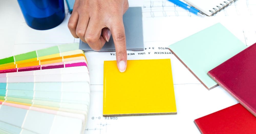
Experiment Before Committing
Never skip sampling your chosen colors. Always test colors before making a final decision. Purchase sample pots and paint small sections of your walls to see how they interact with lighting and furnishings. . This practical step ensures confidence in how to select color for home designs that suit your space.
Trends vs. Timelessness
While trends can inspire, prioritize colors you’ll love for years to come. A modern house colour design doesn’t have to follow fleeting fads; instead, focus on what resonates with your personal style.
Which Colour is Best for House Interiors?
There isn’t a one-size-fits-all answer. The best color depends on your preferences, the space’s function, and how you want to feel in it. However, timeless options include neutral palettes (like beige and gray) that adapt to various styles and decor.
Break the Rules (Strategically)
Rules provide a strong starting point, but don’t be afraid to infuse your personality into the palette. A pop of unexpected color on the ceiling or a bold feature wall can add character to your home while still complementing the overall modern house colour design.
Think About Maintenance
Certain colors and finishes may require more upkeep. Light colors show dirt and scuffs more easily, while darker shades may fade over time. Select colors that align with your lifestyle and maintenance preferences. For exteriors, weather-resistant paints ensure your house elevation colour combination stays vibrant for years.
Regional Influences
Draw inspiration from local architecture, culture, and climate. Homes in tropical areas might benefit from cooler tones that reflect sunlight, while rustic settings pair well with earthy palettes. Regional trends can help you decide how to select color for home designs that resonate with your surroundings.
Seek Professional Help When Needed
If you’re unsure about how to select color for home interiors or exteriors, consult a professional. Interior designers and color consultants bring expertise to create harmonious palettes that align with your vision.
Ghareka, a modern house construction company, takes this a step further by offering end-to-end services for building your dream home. From planning and designing to the actual construction, we ensure every aspect of your home aligns with your vision, including crafting the perfect color palette.
Trust Your Instincts
At the end of the day, your home is a reflection of your personality. Trust your instincts and choose colors that make you happy and comfortable. Don’t shy away from taking risks—it’s these personal touches that make your house truly unique.
Final Thoughts
Creating a cohesive and inspiring color palette for your home is a journey of self-expression and practical planning. Whether you’re focusing on the interiors or seeking the perfect house elevation colour combination, these tips will help you achieve a harmonious and inviting atmosphere. Remember, when choosing how to select color for home designs, trust your instincts, embrace your creativity, and enjoy the transformation process. Your home, after all, is a canvas for your unique story.
FAQs:
What is a minimalist color palette?
A minimalist color palette focuses on simplicity, using a limited range of neutral and muted tones like whites, grays, and beige. This approach emphasizes clean lines, clutter-free designs, and a timeless look, perfect for modern house colour design.
How do seasonal changes affect interior color choices?
Seasonal changes can influence how colors feel in a space. Warm tones like oranges and reds are cozy in winter, while cool blues and greens are refreshing in summer. Versatile, neutral palettes allow you to switch accents with the seasons easily.
What are some common mistakes to avoid when choosing a color palette?
- Using too many bold colors in one space.
- Ignoring the effect of lighting on color perception.
- Choosing colors without testing samples in the actual room.
- Not considering the existing furniture and decor. Avoiding these mistakes ensures a cohesive and well-balanced design.
What are analogous color schemes, and where can you use them?
Analogous color schemes involve using colors that are next to each other on the color wheel, like blue, green, and teal. These schemes are ideal for creating a harmonious and calming environment, often used in living rooms or bedrooms.